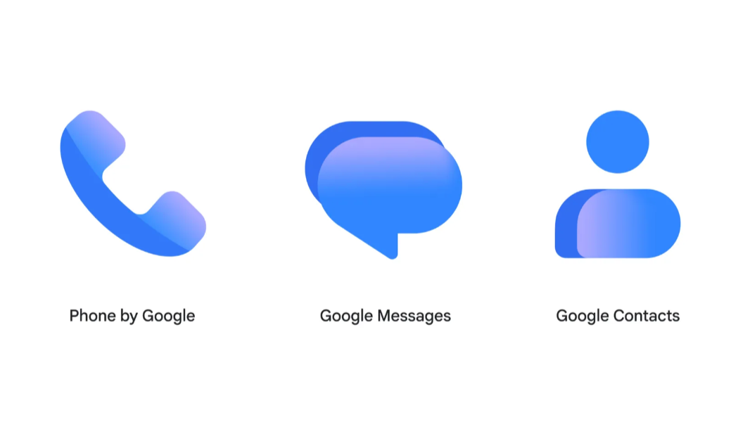
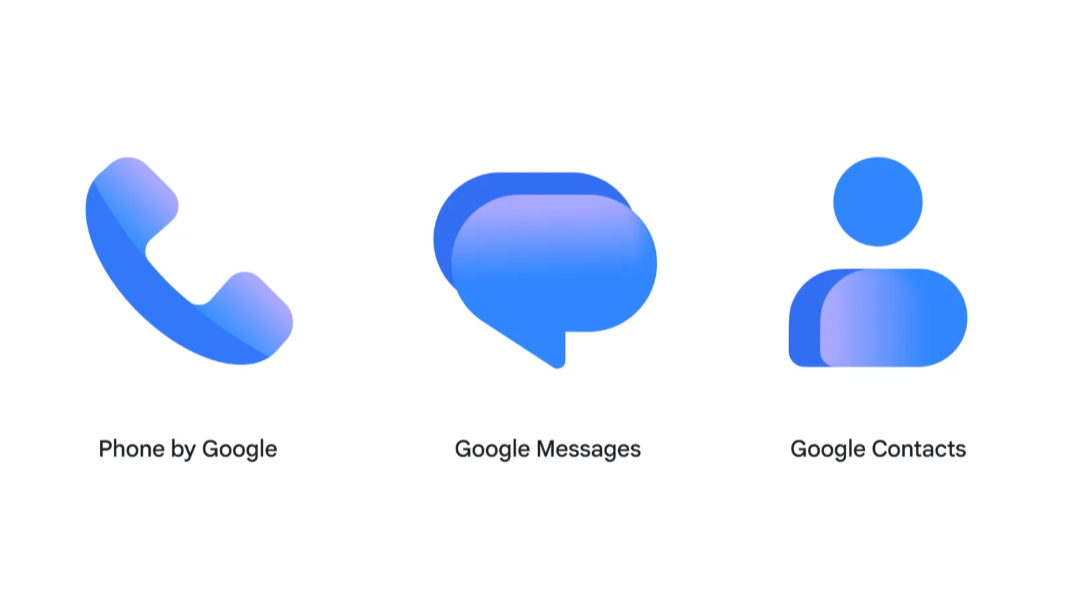
Last year, Google unveiled a new gradient “G” corporate logo, and now it’s begun updating its Android app icons to match.
“Starting today, we’re rolling out refreshed icons for three apps that help you stay connected: Google Messages, Phone by Google, and Google Contacts,” a new Google Blog post explains. “The icons feature updated curvature and coloring to align with the rest of the Google apps you know and love, such as our core Google logo.”
Google says that all the icon updates are sharper and clearer on device home screens, provide subtle but crisp gradients with easily readable edges, and are sleeker and more cohesive.
In a separate post on Google Support about the new Google Messages icon, the company added that it has updated the coloring, spacing, and gradients so that the icon aligns perfectly with other Google icons throughout the ecosystem.
The new icons are rolling out now.